Part of our job as designers is to prototype experiences, processes, and services. When we create prototypes, we talk about the type of prototype in terms of its fidelity, without digging into what low fidelity, mid fidelity, or high fidelity actually means. We also tend to refer only to the level of visual fidelity. This overlooks the decisions that we make beyond visual refinement in our prototypes. Decisions that are crucial to how others receive our prototypes and what information we get from creating them.
This post looks at what fidelity really means in prototyping, why we use varying levels of fidelity, and how that affects the way users, stakeholders, and collaborators view and understand work. We can do this by looking at fidelity in five dimensions:
-
visual refinement
-
breadth of functionality
-
depth of functionality
-
richness of interactivity
-
richness of data model or content
Diving into the five dimensions
Visual refinement
Visual refinement refers to only the visual aspects of a prototype. Are elements hand-drawn? Are components represented by blocks or other abstracted elements? Is the prototype fully styled? How realistic does the visual aspect of the design look?
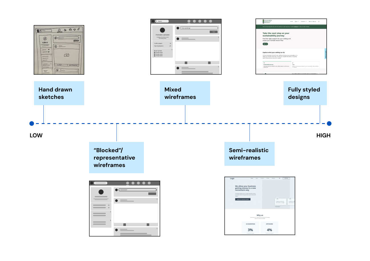
A scale showing the range of visual refinement from low to high. From lowest to highest, it reads “Hand drawn sketches”, “Blocked/representative wireframes”, “Mixed wireframes”, “Semi-realistic wireframes”, and “Fully styled designs”. Each point is accompanied by an image representing the level of refinement.
Breadth of functionality
Breadth of functionality refers to how broad the functionality represented in a prototype is. How many of all the possible functions that could be provided are represented? Are there points where a user may attempt to use something that is non-functional?
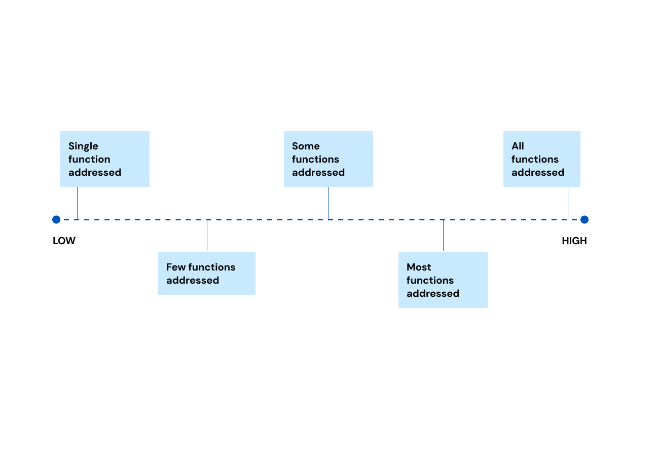
A scale showing the range of breadth of functionality, from low to high. From lowest to highest, it reads “Single function addressed”, “Few functions addressed”, “Some functions addressed”, “Most functions addressed”, and “All functions addressed”.
Depth of functionality
Depth of functionality refers to the level of detail of each interaction, feature, or sequence represented in a prototype. How far can a user proceed through a particular flow? Are some steps skipped?
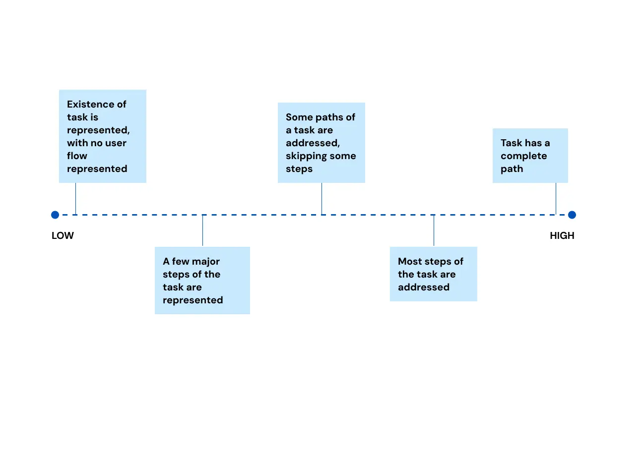
A scale showing the range of depth of functionality, from low to high. From lowest to highest, it reads “Existence of task is represented, with no user flow represented”, “A few minor steps of the task are represented”, “Some paths of a task are addressed, skipping some steps”, “Most steps of the task are addressed”, and “Task has a complete path”.
Richness of interactivity
Richness of interactivity refers to how interactive the elements within a prototype are. Do they have transitions? Do they respond to user inputs? Are they static?
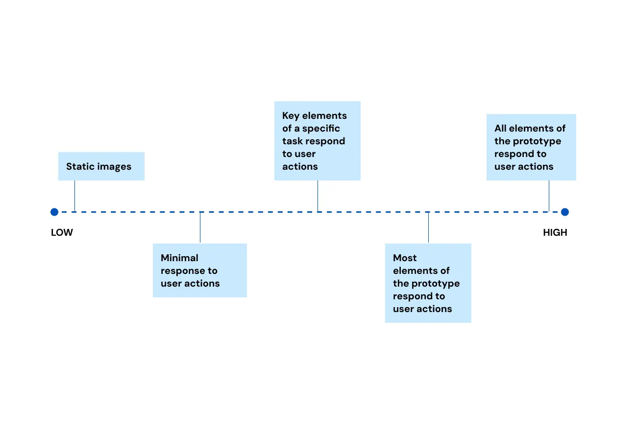
A scale showing the range of richness of interactivity, from low to high. From lowest to highest, it reads “Static images”, “Minimal response to user actions”, “Key elements of a specific task respond to user actions”, “Most elements of the prototype respond to user actions”, and “All elements of the prototype respond to user actions”.
Richness of data model or content
Richness of data model or content refers to the representativeness of real world data or content shown in the prototype. Are we using filler or dummy text? Are we using dummy data that is representative of real data? Where legally and ethically appropriate, are we actually using real world data?
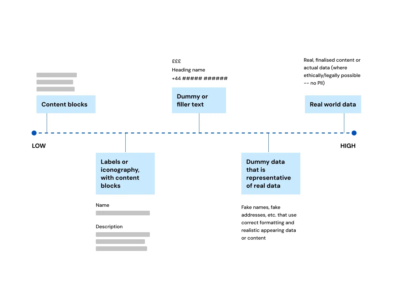
A scale showing the range of the richness of data model or content, from low to high. From lowest to highest, it reads “Content blocks”, “Labels or iconography, with content blocks”, “Dummy or filler text”, “Dummy data that is representative of real data”, and “Real world data”. Each point is accompanied by a visual representation of the refinement of content.
Bonus: Mixed fidelity
Mixed fidelity refers to the usage of different levels of the five dimensions within a single prototype. If you take a look at prototypes you’ve created in the past, it’s very likely that the majority of them are mixed fidelity.
Here are a few examples of how mixed fidelity may be used.
Detailed wireframes that represent a few key steps of a task, using real data and content
-
Mid to high visual refinement
-
Low breadth of functionality
-
Mid depth of functionality
-
Mid richness of interactivity
-
High richness of data model/content
Real content formatted in a Word document for testing (when a Word document is not the intended format for final delivery)
-
Low visual refinement
-
Low breadth of functionality
-
Mid depth of functionality
-
Low richness of interactivity
-
High richness of data model/content
Using WhatsApp with real content to test a messaging app
-
Low visual refinement
-
Low breadth of functionality
-
Mid depth of functionality
-
High richness of interactivity
-
High richness of data model/content
Determining the right level of fidelity
When we create prototypes, we do so to accomplish a particular task. Sometimes this is for testing, sometimes it is for a demo, or sometimes it is simply to communicate an idea with the rest of your team. In every scenario, it’s important to take some time to think about what you are trying to accomplish. How we prototype should be based largely on what the need for that prototype is.
Breaking fidelity down into these five dimensions allows us to be deliberate about how we meet those needs most efficiently. It allows us to stop and think before creating overly complex or highly stylised prototypes, just because it's the process we’ve gotten used to.
It also gives us a way to talk about prototypes and fidelities that go beyond visual fidelity and the tool the prototype is created in, since each level of fidelity can be met in many ways with a wide range of tools or formats.
The concepts referenced in this post come from an article called “Breaking the Fidelity Barrier”, which you can request here. It was shared with me early in my career and changed the way I think about, talk about, and use prototyping in my work.
“This is how we do it” — Interaction Design at TPXimpact
A snapshot of the Interaction Design practice at TPXimpact and some of the recent projects we’ve been working on.
Read more
Our recent design blog posts
Transformation is for everyone. We love sharing our thoughts, approaches, learning and research all gained from the work we do.
-

-
A celebration of our Design Academy
Read blog -

-